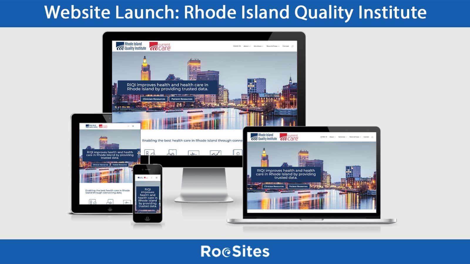
Website Launch: Rhode Island Quality Institute

We are thrilled to announce the launch of a new website for Rhode Island Quality Institute

Founded in 2001, the Rhode Island Quality Institute (RIQI) operates Rhode Island’s Health Information Exchange (HIE) and is the state-designated Regional Health Information Organization (RHIO). We are a center for collaborative innovation that enables the best healthcare in Rhode Island making available trusted data and information. With a wide array of services available, we facilitate improvements in health and healthcare through initiatives that support care coordination, reduce medical errors and waste, advance quality measurement, and engage patients and families in their care.

🌐 View Website » https://riqi.org/


Going The Extra Mile For Your Clients

Blog Post: Going The Extra Mile For Your Clients

Sometimes, going the extra mile doesn’t help your business financially, but it does have positive long-term benefits on your business and your bottom line.

I recently ran into a situation where I had to make a decision. We have done some design and development work for a non-profit and there was a page that was sticking in my craw (as the expression goes). It was one of those pages where displaying the information properly just wasn’t easy from an information architecture standpoint. There was so much content and I had to figure out a good way of displaying it. The pages were just too long, and the fear was that people would never see the content well past the fold.  But the organization wanted people to be able to see all the info on one page and not have to click on 5 separate pages.

For my second attempt:
I got an idea to do these toggles. It was a good way of displaying the different sections in such a way that people couldn’t miss the content were looking for. Unfortunately it just didn’t look right. It looked a little dull, and not much to entice people to click.

For my 3rd attempt:
I decided on a different approach to building the pages. I switched to a tab layout.  As they say, the third time was a charm and the page looks great. A visitor to the website can easily find the information they’re looking for and click between the tabs. Now some experts aren’t crazy about using tabs in web design, but used correctly tabs work well from a usability standpoint.

Bottom Line:

The time I spent on these pages amounted to 2 extra days and is not something I am going to get paid extra for. As I charge on a project by project basis, not an hourly rate, this will not be a profitable move for me and my company. But, by doing the right thing and going the extra mile the client is thrilled and I expect I will get some referrals from this website. And after all, referrals are the lifeblood of my business, and many others.

So when you’re thinking about a business decision, take the long view, you will be happy you did. And, If this is the kind of service you are looking for, contact us.


Related Content:

Helping Others Helps Your Business