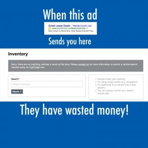
Here are simple tips to improve your pay per click ad performance and save your company money.
 Check your ads: I was looking at car dealer’s ad which enticed me to click. When I did I was sent to a page which says “no cars found”. Now this dealer is spending a lot of money for clicks and he’s probably losing potential customers and definitely throwing money away.
- Set Proper Location: If you are a local or regional business, make sure your ad is only set to display in that area. Too many people’s forget to set up their ad to display near their location. Your ads should only be set to display in places you do business. For instance, Bob the plumber from Boston MA shouldn’t be having ads display worldwide. My guess is Bob isn’t flying to Beijing to unclog a toilet. Every click outside your business area is money down the drain (so to speak)
- Set Time Ads Display: I am not a big fan of ads running 24 hours a day. I think that most clicks in the middle of the night are probably just people fooling around, tire kickers, and perhaps people outside the country using proxy servers. How much business have you received from somebody clicking on ads at two or 3 AM? I pretty much think you’re better served having your ads running during normal business hours and perhaps a couple hours before after.
- Remove Keywords you don’t need: When you’re in your ad words account and you’re finding suggested keywords, sometimes we add some without realizing that those clicks will not lead to business. For instance, if you are selling business products rather than consumer items, a click on someone looking for a consumer product that will not bring you business is a waste of money and a budget killer. By sorting on your clicks you can see where your budget is going, if those dollars are being spent on a keyword that are questionable, try pausing it. You can always turn it on later if you find that you were mistaken. But more money get spent on that keywords and that is what you want to avoid.
- Avoid Wholesale Changes: People tend to panic when it comes to their pay per click accounts. If they’re very successful, and then see a bit of a downturn the thinking it is to go in and blow up the account. I am here to tell you not to panic because that is the nature of the beast. There are definitely periods of ups and downs. But if you are having good luck with your ads and are getting business from them give it time. Perhaps tweak your ads and keywords, but don’t destroy what you have worked hard to achieve.
Bottom line: Pay Per Click Advertising (Definition: PPC) is not an exact science. It takes monitoring, tweaking and paying constant attention to your account. Taking these five common sense tips, you can save money and hopefully be far more effective with your advertising spend. Of course, this is the tip of the iceberg, if you need more assistance contact us today.

