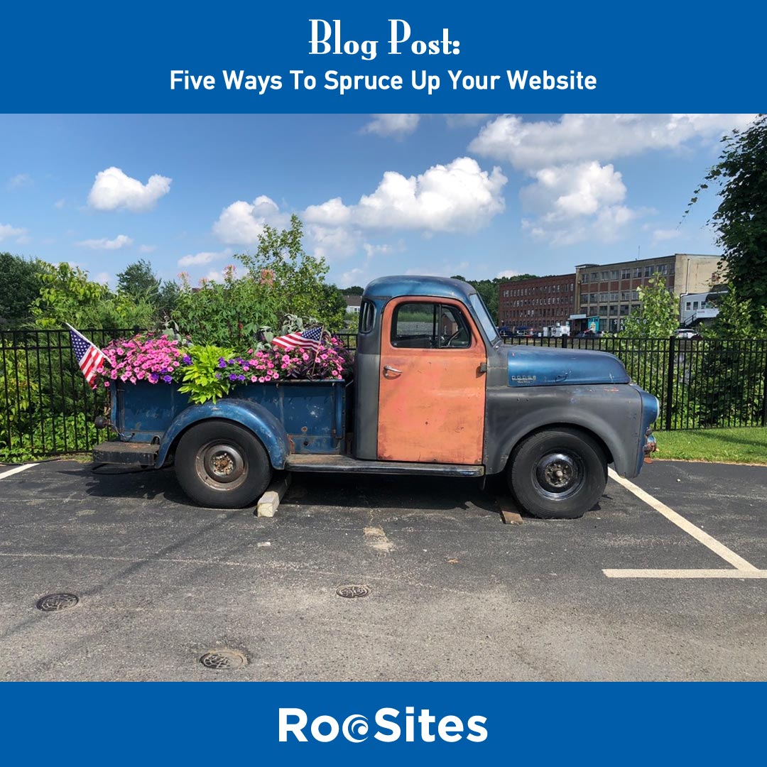
So, like everything else I am always drawn back to ideas for my business, designing and maintaining websites. (I know, only a geek would be constantly thinking about web stuff. I am what I am)
But I had some ideas looking at this old truck. Many websites (like the truck), don’t need to be scrapped, but they do need some sprucing up.
So here are five ways you can do that:
Number One: New or Updated logo.
By changing your logo, even a little bit, you can really make a statement. I feel that every design should start with the logo as that is the key to your branding, color scheme, etc. Over the last decade, more and ways to design logos have sprung up, so for very little money you can have a great logo.
Years ago you would go to an agency to create your logo. They would spend time and asking questions and finally come up with three possibilities to choose from, which they charge you 15, or $20,000 or more. Contact me, I will show you how to have a great logo at an affordable price. (And you’ll have many options to choose from)
Number Two: Update your sites imagery.
Is your site filled with tacky stock photos, like the operator wearing the headset (see below) or a number of the other photos you’ve seen on a million websites? If so, consider updating the images on your website. The best photos are the ones of you and your company and your business. You can either take the photos yourself or hire a professional photographer to come in and spend a couple hours. It isn’t that expensive and the results can make a huge difference in the look and feel of your website. If must use stock photography, do it in such a way that it doesn’t have that stock-ish look. So use images that are a bit abstract, something eye-catching, but not the two guys shaking hands. (One of my pet peeves)
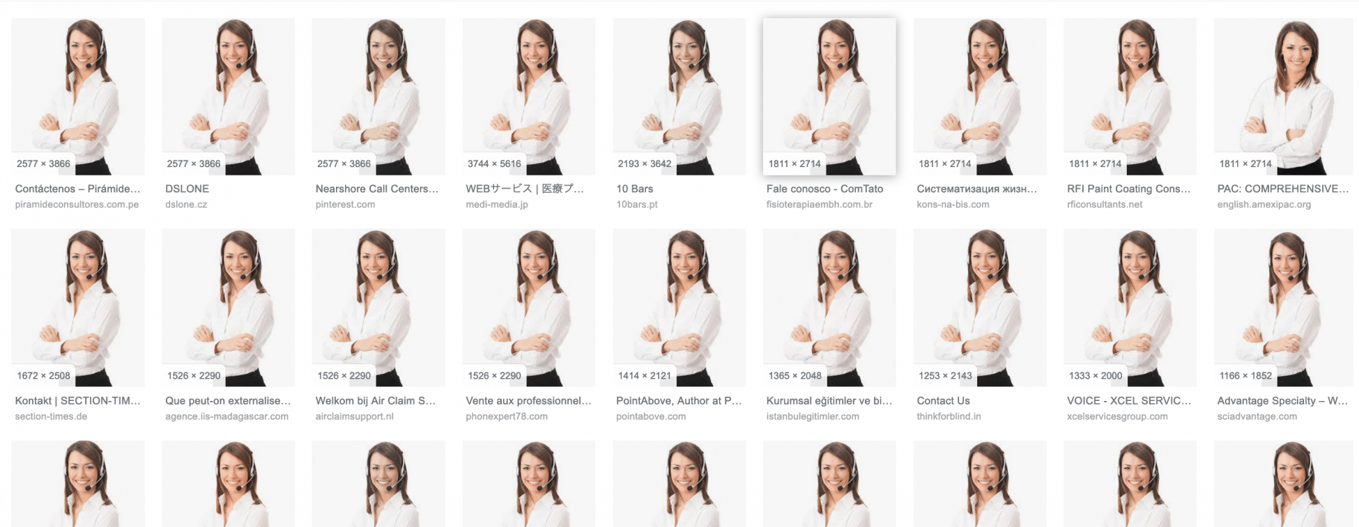
This Photo is on 100s of sites (if not 1,000s) and example of overused Stock Photos.
Number Three: Video
Video is a great way to add value to your website. The numbers prove that people will watch a video, more then they will read pages of text. The best part is that you can take a video yourself; it doesn’t have to be professionally produced, although of course that is a good option as well. Videos are also great to promote on social media, as people are more likely to click on a link to your blog with an embedded video than just a plain text article.
Consider these numbers from HubSpot:
1) Mobile video usage has increased by nearly 10 million daily viewing minutes in the last 2 years.
2)
Video is important, as these numbers prove. #3 is one to consider if you are looking for ideas. People love “how to” videos. So if you can produce a video that solves someone issue, chances are you will get plenty of views, and who knows, perhaps a viral video.
Number Four: Typography
One thing a lot of people don’t think about when designing or working on their website is typography. Simple changes to a font as an example can make such a big difference. I was looking at a potential new client’s website the other day. Well, what hit me was they were using the smallest font sizes, and it made it hard to read. Their headline fonts were using this very fancy font-face that was difficult to make out. So, by just bumping up their body font a couple of pixels and changing their headline fonts to something far more readable, their site looked hundred times better. Because we now have Google fonts and other embedded fonts available, people have gone crazy trying to use nonstandard font families. For me, when we are talking about body fonts, the cleanest, easiest to read fonts have always been and always will be the best to use. Now, don’t get me wrong I like fancy fonts for headlines, you just don’t want to go to crazy and end up using something that people have a hard time reading. And remember, over half of your audience is probably on cell phones which makes goes small and fancy fonts very hard to read.
Number Five: Form Simplification
When you go to a website and someone has a contact form with 10 or 15 fields, chances are you don’t fill those out. So my number five tip is to simplify those forms. You want people to contact you or request more information, so collect as little information as possible. Someone’s name, phone Number and perhaps a text area for them to tell you what they need or are interested in. In this day and age people are afraid to fill out forms as they’re so scared with what company may do with the data. So by simplifying your forms hopefully you will get a better response. As most people will tell you the amount of forms filled out has declined considerably over the last five years, so make it as easy as possible for your website visitors.
In Closing
So like that beautiful old truck seen above, you don’t have to scrap your website, you can make changes to spruce it up and get it looking good again. This of course is only five tips, there are obviously many things you can spruce up your website. We would be happy To help you, contact us anytime.
If you have some tips of your own, please leave them below, we always welcome comments and the opinions of others.