The reason this came into my mind was I had taken over managing the website for a company a while back. They had one of these wacky menus as I like to call them. It spanned the width of the page and had 50 sections. It took me five minutes just to find where their contact page link was! To me this is the exact opposite of what UX design [Definition] is all about. Now I have to admit, it did look pretty cool, you had pictures, different sections, separators and all kinds of cool and funky things. But what a mess from a user experience standpoint. I explained to my client, which I have preached since 1996 is to have a simple clear menu. Everything on your site should be a couple of clicks in, unless you are a big big company with thousands and thousands of webpages.
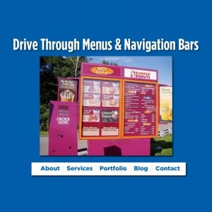
I look at it like this, the main menu buttons themselves are kind of like fast food restaurants’ value meals. These are the main sections of your website and the most important. These are your bread and butter, these are what you need people to click on to see your most valuable content. Under those, you can have various subsections of your website. But don’t go crazy. I hate when you mouse over a link and then you see another level of links and then you mouse over that and you see another level. (I am tired just writing about it) To me this gets away from good design practices. I’m not saying it’s never necessary, but my feeling is you should avoid those third and fourth level menus if at all possible.
Now that about 50% of your visitors are looking at your site on mobile, the simplification of menus has taken precedence in our user interface designs. You want to make sure that mobile menus are so simple and you’re not seeing 30 or 40 links.
Use the KISS principle when planning menus. Keep It Simple……