AI-powered personalization involves using algorithms and machine learning to deliver individualized content, product recommendations, and experiences to users based on their behavior, preferences, and past interactions. This approach can significantly enhance user engagement, increase customer satisfaction, and drive sales.
For small businesses, creating a personalized user experience can mean the difference between a one-time visitor and a loyal customer. Personalization helps in:
Contrary to popular belief, integrating AI into your web design for personalization does not require a large budget. Here are several accessible tools and methods small businesses can use:
There are numerous AI-driven platforms designed to help small businesses personalize their websites without the need for extensive coding knowledge or resources. Tools like Optimizely, Adobe Target, and Dynamic Yield offer various levels of customization and can be integrated into existing websites to start delivering personalized experiences.
AI-powered chatbots can provide personalized assistance to users visiting your website. Platforms like Intercom, Drift, and ManyChat allow businesses to implement chatbots that can answer frequently asked questions, recommend products, and guide users through the site based on their interactions.
Email marketing services such as Mailchimp and Constant Contact offer AI features that enable businesses to send personalized emails based on user behavior and preferences. This can include tailored product recommendations, content, or reminders that resonate with each recipient.
Utilizing AI-driven analytics tools like Google Analytics and customer data platforms can help small businesses understand user behavior and preferences. Insights gained from these tools can inform how to tailor the website experience for different segments of your audience.
AI-driven personalization offers a powerful way for small businesses to enhance the user experience on their websites, fostering deeper connections with their audience and driving business growth. By leveraging accessible tools and following best practices, small businesses can implement personalization strategies that make a big impact, even on a small budget.
In the era of digital personalization, the message is clear: tailor your website to your audience’s needs and watch your small business thrive. If you need help with AI, we are always here to assist, contact us anytime.
Related Post: Unlocking the Potential of AI: Benefits and Cautionary Considerations
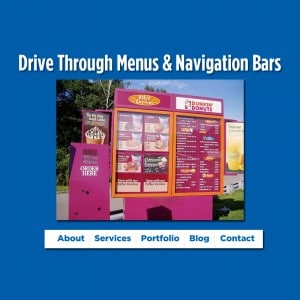
 The other day I pulled into a Dunkin’ Donuts Drive through lane. There it hit me. Voila, the menu was clear concise and I could immediately could find what I was looking for. I thought about it, and this is very similar to my goal when I build a navigation menu for people’s websites. Think about it, when you go to drive-through window they do a very good job of putting the things they want you to see (and order) front and center. These may be value deals and different things like that. Easy to order, and my guess is profitable for the franchise.
The reason this came into my mind was I had taken over managing the website for a company a while back. They had one of these wacky menus as I like to call them. It spanned the width of the page and had 50 sections. It took me five minutes just to find where their contact page link was! To me this is the exact opposite of what UX design [Definition] is all about. Now I have to admit, it did look pretty cool, you had pictures, different sections, separators and all kinds of cool and funky things. But what a mess from a user experience standpoint. I explained to my client, which I have preached since 1996 is to have a simple clear menu. Everything on your site should be a couple of clicks in, unless you are a big big company with thousands and thousands of webpages.
I look at it like this, the main menu buttons themselves are kind of like fast food restaurants’ value meals. These are the main sections of your website and the most important. These are your bread and butter, these are what you need people to click on to see your most valuable content. Under those, you can have various subsections of your website. But don’t go crazy. I hate when you mouse over a link and then you see another level of links and then you mouse over that and you see another level. (I am tired just writing about it) To me this gets away from good design practices. I’m not saying it’s never necessary, but my feeling is you should avoid those third and fourth level menus if at all possible.
Now that about 50% of your visitors are looking at your site on mobile, the simplification of menus has taken precedence in our user interface designs. You want to make sure that mobile menus are so simple and you’re not seeing 30 or 40 links.
Use the KISS principle when planning menus. Keep It Simple……