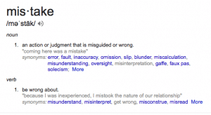
HealthCare.gov – Huge roll out tainted by performance problems, and defects. Now while there is plenty of blame to go around, to me it comes down to some basics. Someone had to signoff on the website, with the knowledge about the remaining open bugs, as well as the performance issues. Every big company does performance testing, including longevity tests, capacity, etc. Someone high up had to say “GO”.
What you can take away: No matter how good your website developer is, typically websites have defects. As a website owner, you can do your own user acceptance testing. Don’t go live until to are happy with your website. Do not allow your website to be launched with bugs you deem to be high severity.
Chevy Nova – This may be more urban myth than reality but its still a good lesson. The story goes that Chevrolet tried to sell their car in Mexico but failed due to the name. No Va translates to ‘No Go’ which is obviously not a great selling point!
What you can take away: Names are important. In terms of websites, when picking your name, consider competition. Don’t choose a name that there are 100s with the same name. For one thing, you won’t get a good domain name, and you will have people finding your competition when searching by name in search engines.
AAA – This is story defies common sense. I had Triple A for many years. I then bought a car that had free roadside assistance and my insurance company offers it as well. So I didn’t need AAA. But with a daughter in college, I wanted the added protection. Here is the amazing thing. They won’t let me get Triple A Plus, which is MORE money. I wanted plus as it includes 100 miles towing. Truthfully the 3 mile towing you get with basic is useless. So here is what they said, you have to have basic coverage for 2 years before upgrading no matter how long you were a member for. So they won’t let you pay MORE. In this economy they are turning away money and worse, lost a potential customer since I will now go elsewhere. The dumbest part of this? This is a regional club rule specific to Southern NE AAA. They even send me their rule book. Horrible customer service.
What you can take away: In this economy do everything you can to meet the needs of your customers. NEVER refuse your customer’s needs and wants. If your website restricts users from actually upgrading their order, fix it. Fix it fast. And customer service means the customer is always right (remember that old adage?). You may not be the biggest company but you can have the best customer service.
BlackBerry – This was the single device you had to have as a business person. They lost their way and tried to compete with iPhones and other touch screen devices and lost their core audience. Now they can’t get back the business user and is a company in free fall.
What you can take away: Stick to what works. if something is selling on your website, or if your informational site does well, don’t get away from what is working. A new site isn’t necessary better and getting away from selling what people have bought from you is business suicide.
Western Union – Western Union had a shot to buy the patents from Alexander Graham Bell for $100,000 but said no. This is considered the worst mistake of an American CEO.
What you can take away – Be open to new things. Especially on the web. It wasn’t that long ago that we had no such thing as responsive design. Now it is almost mandatory building a website. Flash was a staple, now it is rarely used. Things change, be nimble and accept that this industry is always evolving.
Bottom Line: Fortunately small business errors aren’t under the microscope and publicized like the larger companies and agencies above. But to a small business an error can be crucial and mean the difference before survival and being forced to close.

Now if you are wondering more about the content of your social media posts, I refer you back to one of my favorite blog posts, The Power of SME (Subject Matter Expert). I always advocate posting things that portray you as a subject matter expert or thought leader.