NFL Draft Similar To Hiring Web ProMay 12th, 2014

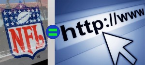
NFL=Web Bet you never thought you’d read that as a title for a post?

The truth of the matter is I never thought so either until the last few days of watching draft coverage. In reality the way teams pick players is similar to the way you SHOULD hire a web professional to design, develop and manage your website.

Here are the reasons, hear me out, they will make sense to you. (I think)

Film: Countless hours of film are watched on every player projected to be in the draft. The similarity here is that you should thoroughly review a designer’s portfolio.  Don’t take their word how good they are, review their sites and see for yourself.  Click around, do you see errors? If there is evidence of sloppy work, they probably aren’t the company for you to enter into a relationship with.

Team Visits:  Players are invited by teams, and are tested and interviewed.   For you this is the meeting you have with the web pro, it can be in person or via a phone call.  Prepare a list of questions, hit them with your requirements and see how they answer.  If they talk down to you or can’t answer any questions then cut the interview short.   Now some questions require research so if the web pro tells you they’d have to look into certain requirements, that is ok and actually a sign of honesty. More than anything ask yourself, is this someone I can work with? if you are uncomfortable at this point the relationship won’t get better.

Background Research: Teams thoroughly look into player backgrounds and seeming top picks drop like a stone as they have questionable morals or red flags.   For you this is checking references. Ask for a few clients to speak to and see how this person is to work with. Also see how they respond to support requests.  If they don’t respond quickly, move on.

Bottom Line: See, it is a very similar process, both take a bit of work, but in the long run you will be happier if you follow these steps. Some NFL teams to better than others year after year. The reason is simple, they follow tried and true practices and always seem to come away with the best players.  While it is luck grabbing players like Tom Brady in late rounds, in business we make our own luck. So put the time in before you hire a web professional and you will be much happier long term.


Learn from Superbowl AdsFebruary 10th, 2014

commercials While sports fans relish the Superbowl for the love of the sport, a large segment of the population likes to watch for commercials and halftime shows. With a huge worldwide audience, advertisers line up spend millions for 30 second spots. You can learn from advertisers hits, as well as their many misses.

I have been thinking about this since Seattle crushed Denver. Here is my take on this year’s commercials. I discuss four companies that scored big and one that fell woefully short.

  1. Budweiser – Once again they hit a homerun with the commercial featuring the golden retriever puppy and his friendship with the Clydesdale. They also scored with hero’s welcome.  Both left you with a good feeling about the brand and tugged at the heart strings.
    What you can take away: Having people feel good about your brand is important especially with customer retention. Companies like Bud don’t need brand recognition, as they have that. Before you try something on your website, be sure to think about it from your customer’s perspective. Will this portray us in a positive light?
  2. Audi – this made me laugh out loud. Doberhuahua was hit. Humor either works or it doesn’t. Audi scored big time. Hey, its the first time Sarah McLachlan spot about animals didn’t make me cry. Brilliant!
    What you can take away:  Getting people’s attention is so important. Audi did that by using humor and at the end they tell you the message, “Compromise Scares us too” & “Luxury without compromise”.  For your website project consider not taking yourself too seriously. Use humor where possible. BUT test what you are doing, comedy is tough to pull off. But if done right it can be effective at grabbing people’s attention.
  3. Coca-Cola – like Bud, they don’t need brand recognition, but they need people to feel good about the brand. After all soft drinks are not exactly popular among health conscious viewers. But their commercial sure made you feel good, patriotic.
    What you can take away: Similar to number 1, having people feel good about your brand is important, and this is so true on web projects where people can disappear in a click…
  4. Doritos – Once again they were right on with a hysterical new ads, Cowboy Kid & Time Machine.  They have gotten to the point that when you think nacho chips, no one else even comes to mind.
    What you can take away: Stick with what works. Doritos has year after year scored with great commercials and their brand recognition is stronger than ever. if you are hitting on all cylinders with your website, don’t get away from what is working. Newer ideas aren’t always better. If it ain’t broke, don’t fix it!
  5. GEICO – They used a recycled commercial. Nothing new.  Boring, and surprising for a company whose marketing has gotten them to where they are today.
    What you can take away: If you are having a big event go new, use imagination. Not the same old same old. If you are launching anew website, make sure it is fresh, up to date and rocking from a design and content standpoint.

Bottom Line: There were other hits and misses, but mainly a bore-fest. Shockingly a bunch of companies used ads that were weeks old.  Seems a poor media spend at 3 mil for 30 seconds. In the past we saw much more originality.

Fortunately, you can learn from their mistakes without writing a huge check. It is funny, at RooSites I spend quite a bit of time talking people out of overspending on ideas I know won’t be profitable. Though in the short term that probably doesn’t sound like a good business strategy,  in the long term it pays dividends as clients stay with us longer. In 2013 for instance we had a 99% client retention rate.


Categories

Tags