Think of it as the one small step for man, one giant step for mankind quote, but rather than walking on the moon, we are talking about customer service going well beyond the norm.
I recently had an interaction with a business that left me so impressed; I had to blog about it. I was moving into a new house we are building and we had a light fixture that hangs down over the dining room table. The problem: the table hasn’t been delivered yet so the fixture is hanging there in the open where you can bump into it. Like a dunce, I smacked my head into it and cracked one of the glass globes.
After I got done beating myself up for being so stupid, I emailed the company I bought the fixture from. They told me they had it in stock and come on down.
I explained that their product wasn’t faulty and I smacked into it with my big head. When I pulled out my credit card to pay, the gentleman Chris told me no charge, have a nice Christmas.
I was so impressed by this, that I told everyone I know and I will refer and recommend them to anyone looking for lighting products. That seemingly small deed will reap big rewards.
Now I had given this company a lot of business as they furnished all the lighting in my new home. But still, business is business and they had every right to charge me for the new glass. I expected them to charge me. But, instead they did a nice thing.
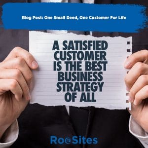
Bottom line: When you go out of your way to provide excellent customer service it leaves people with a positive impression of your company. When you respond quickly and get things done for people, they appreciate it, as so many times in today’s world people wait weeks for assistance even for small tasks. In my business, this describes our view of website management. We developed a best in class support service model and answer inquiries the same day. This is unheard of in my business and people are so surprised when we email them back that their request has been completed. Again, small deeds reap big rewards, for us this is proven out by all the referrals we receive from satisfied clients.
In case you are wondering, the store in question is The Lighting Gallery of Taunton, 82 Weir St, Taunton, MA 02780. Website: http://www.bristollights.com/

It was right after the 2016 election cycle and people on both sides of the political spectrum were divided like never before. I advised Business people to stay out of the fray. Because, everyone has their own opinions, and some you will not agree with. But for the most part, if you are a business you will do business with anyone who wants to pay you or buy your products. (Within reason of course, not speaking of hate groups or the like)
So now, I am bringing up the same topic again. We just had the most contentious Supreme Court hearings ever. Once again both sides are so divided. So again I am giving the same advice. In terms of your business website and social media accounts, stay out of politics.(Unless of course you are a political adviser, or commentator makes a living off of politics)
Succeeding in many businesses today means having a broad appeal. You want to take in as much business as possible. Can you imagine if Amazon before they would allow you to purchase asked what your political views were? Of course they wouldn’t, and this of course is a silly example. At the same time, the point is valid, get business from everyone you can, and maximize your profits. This of course is simple economics, but it is something that can be affected by something as simple as a post which many of your potential customers/clients find offensive. The last thing your business needs is to be boycotted.
Personally, I even advised clients to stay out of the fray on their personal social media accounts. The reason is simple, a lot of times you get referrals and recommendations from friends & contacts on social media. Now if you alienate people, you are probably eliminating half your referral sources, at least among your friends and contacts.
Social media has allowed people to spread their views far and wide. It Is one of the truly great things about being an American with free-speech. But that isn’t what this post is about. I am taking a look strictly from a business standpoint. So yes, while you’ll certainly have a right to let your feelings be known, as a small business it certainly isn’t advisable and not a great marketing strategy.