A lot of exciting things happening at RooSites and we wanted to get you caught up.
We are proud to announce we have been nominated by Lawyer’s Weekly for Best Website Provider! Please consider voting for us!

Scroll down and you will see RooSites. If not we are under the Web Design Category.

….More Later….
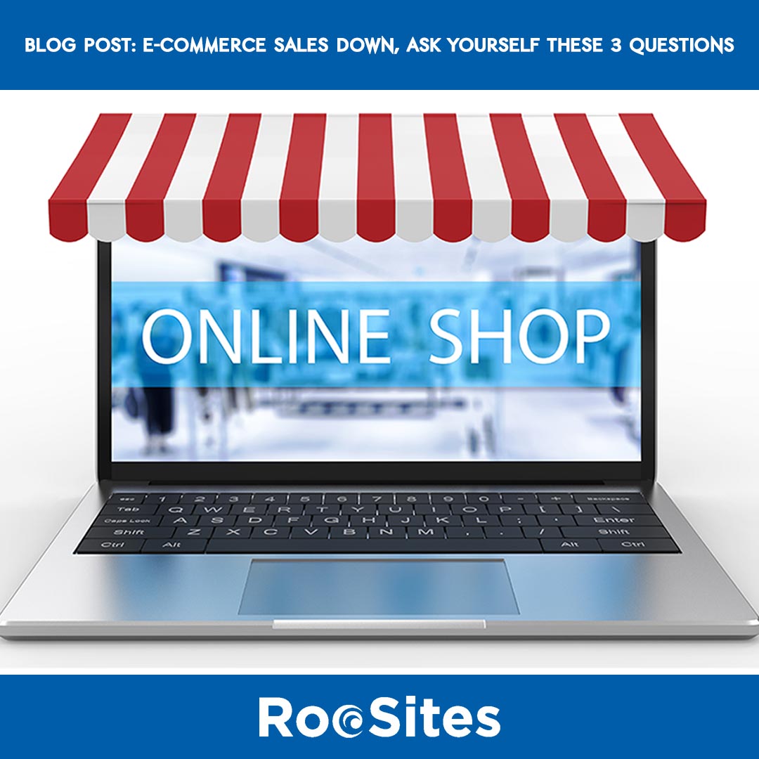
1) How easy is it to purchase items on your website?
In this day and age your website needs to be easy to use, with a single page checkout. If not, if you’re still using an old-fashioned, convoluted multi-page checkout, then you are losing business. If it is hard for users to find what they are looking for, then you are losing business. A simple e-commerce interface will help these issues. And the cost of building this type of website has gone down a lot the last few years.
2) Are you still charging a lot for shipping?
We are living in an Amazon world, like it or not. Prime allows you to get many items the same day and most within a couple of days for free. So, if you are still charging a lot for shipping, you need to rethink this. I had one client whose prices were actually pretty good, but when you figure in the cost of UPS, the shipping cost ended up being more than the actual product cost. So I always ask the question, would you buy this? The answer is typically no unless it is an item not available anywhere else.
3) How are your prices?
Again, people are used to using Amazon as well as Google Shopping to compare prices. So I advise my clients to do some comparisons to see where they stand. If your prices are out of whack, there is no reason for someone to use you, other than loyalty or convenience. But with most things available same day on Amazon, the convenience factor really goes out the window; unless it’s something somebody needs right away. Prices of course are the main driver for people to shop online. I did an experiment with a client who was not having much success selling online. I told him to take a common item, and to price it basically as a loss leader. As the product appeared in Google shopping results, and his price beat everyone else, his sales increased dramatically. He had been kidding himself that his price was competitive, but in reality he was far from the best price. The one thing he learned was that the people who’ve bought his items came back and bought other things as well. Now obviously you can’t beat everybody’s prices for every item, but perhaps some of those are not things you should be trying to sell online. Especially of course if you have a brick-and-mortar store as well. I may stop into a local store for a bit more money, but I am not ordering online for more money.
Bottom line: you want to have an e-commerce website, be realistic in your expectations. I am sure when you shop, you are looking for the best price (including shipping) and of course convenience. It is the same with your customers. So, don’t kid yourself, set your prices fairly, make sure you can ship for reasonable cost (or even better, free), and of course make sure your website is easy to navigate and for people to find what they need. If so you should see a marked improvement in your online sales.
RooSites has been designing, developing and managing small business websites since 1996. For assistance, please contact us.