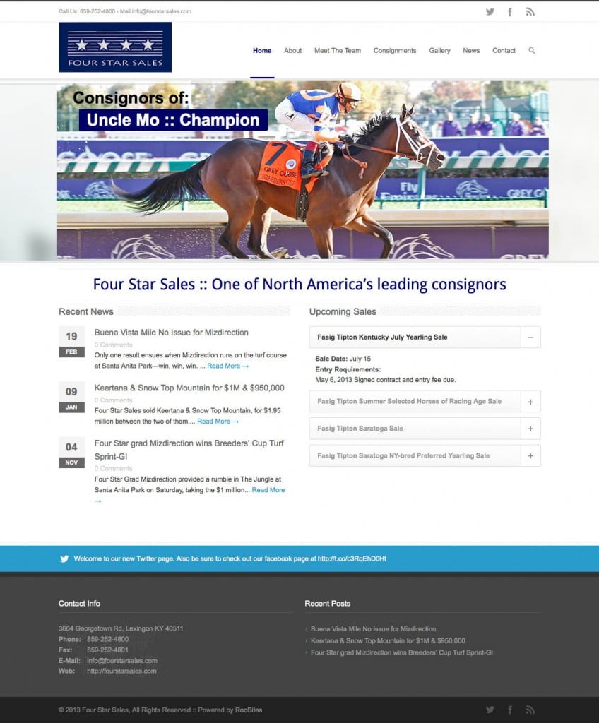
We are happy to announce the launch of a new site for Four Star Sales of Lexington Kentucky. Four Star is one of North America’s leading consignors of thoroughbreds at auction.
Visit the site at: http://fourstarsales.com

As I sit looking out my window on a snowy Sunday afternoon, I thought how pretty the landscape looked. It has been roughly 9 days since the blizzard of 2013 hit. When the blizzard first dumped a few feet of snow, it truly was a magnificent sight. It was beautiful, Mother Nature at her finest.
Fast forward a few days, the look was downright gross. The snow had turned a grimy dirty color, and the scene no longer held any signs of the beauty. Then, along came this mini snowfall today and again the scenery was cheery and great to look at.
So what the heck does this have to do with web design or development you ask?
Good question. Many times clients come to me with a site that is dated looking. But, the funny thing is, sometimes they are doing quite well in Google searches. So what should they do?
Think snow I say!! Remember how that new layer made the scene look wonderful again? The same can happen with your website.
You never want to mess with great search results. But this is a perfect opportunity to put a fresh coat of paint so to speak. Redesign the site but keep the content the same. You will still have great search results, but hopefully your conversion rate will improve as it no longer looks outdated.
Note: If you have a WordPress site, this is a great time to update your theme, with either a custom designed theme or purchasing a new one. As most of the new themes being produced are responsively designed, that alone makes it worth upgrading.