ShortStaf – Venice FL – On-Demand Party and Event Staff
David Douglas Greenberg – Boca Raton FL, NYC – Chairman Of The Board at Ziyen Energy, Former NYMEX Board & Executive Committee Member, Keynote Speaker – Greenberg Capital
Pembroke Titans Against Drugs – Pembroke MA – Pembroke Titans Against Drugs (PTAD) was formed in August 2014 with the vision of Pembroke Massachusetts as a drug free community.
Sharon TV – Sharon MA – Community Television Station
Update: A couple of years back I wrote this post about working from home. With a record number of people now working remotely due to the Coronavirus (COVID-19), I decided to update and re-release. As I am not a physician, if you have any questions concerning health or the virus, consult medical professionals.
As a web developer who works from home most of the time, people often ask me for tips and advice on how to be successful. While it isn’t for everyone, for those of us who know how to make it work, our lives are markedly better then when we had to commute to an office.
Here are 10 tips:
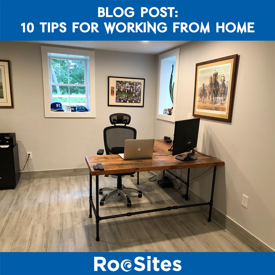
Workspace One is the most important things you need is quality work space. You need a place where you can be alone, (especially if you have family) you also need to be comfortable. I prefer a minimalist environment, and have everything right in front of me. A good office chair is also very important. When you’re young, you shrug off any talk of ergonomics. But as you get older you start to see the benefits of sitting correctly and a properly aligned desk. Early in my career I thought I was starting to get carpal tunnel disease. The company I was working for brought in an ergonomic specialist who raised my desk height, changed my monitor height and adjusted my chair. The pain soon disappeared and I haven’t (knock on wood) had any issues since. So invest a little bit of money in your workspace, you will be the beneficiary down the road.
Lists, lists and more lists This is the single thing I recommend most to anyone trying to work remotely. Especially people who have had years working in an office environment. I try to make a list at the end of every day for what I would like to accomplish the following day. Now here’s the secret: Give yourself more tasks than you can possibly accomplish. This let’s you strive to have an extremely useful day. While you may not get through your entire list, this insures you didn’t slack off and you will achieve quite a bit. Now say you had a simple list of three or four items, chances are you can do that easily, but then you’re not really reaching your full potential or pushing yourself.
Don’t be nailed down to a chair I tend to think best when I’m moving around. So many times while call using a headset I am walking around from room to room. Now if somebody ever saw me they’d think I was half nuts, but I have learned that I can focus so much more by moving. It has also been proven to be much better for your health not to be sitting in a chair for eight hours a day. Others of told me they take a couple of hours and go to a coffee shop or someplace and work from there. Whatever works for you, just don’t try and sitting that seat all day, your health and work will be adversely affected.
Update: Going to a coffee shop for a couple of hours probably isn’t a good idea. But do get up from your chair every once in a while and move around as much as possible.
Exercise
This goes with the item above. Each day set aside some time for exercise. Whether that’s going for a walk, using a treadmill, exercise equipment, or even going to a local gym. This is not only good for your health but it’s also good for your mind, As being stuck at home all day isn’t great for your psyche or your body. Make sure exercise is not optional, rather something that you require yourself to do.
Update: Going to a gym may not be an option, but do make sure you get your exercise in if possible.
Try to keep a regular schedule This is very important. Try to be somewhat consistent as to your time in your home office. Even if you work for yourself, you’ll find having a consistent schedule increases your productivity. Now it doesn’t have to be exact, for me it is usually whenever I wake up which can range from 5 AM to six or 630. Still I am hours ahead of people who were commuting just to get to a job by 9 AM.
Don’t be afraid to shut the door when working from home I don’t mind hearing family members in the background. But there are times that you need quiet or have a call. If so shut the door and let people know that that is this signal that you do not want to be disturbed.
Pretend you’re not home This sounds a bit strange, but hear me out. I do not answer my house phone when I am working from home. Most calls to the house are telemarketers or people looking for a family member. Others will call my work line. If you are worried, look at the caller ID and answer if you think it’s and emergency.
Eat Meals and Healthy Snacks ONLY One problem some have is gaining weight due to their proximity to the kitchen. I eat my regular meals, and a healthy snack every couple of hours. It is important to stick a food schedule as well as a business schedule (Number 5).
Have fun
Yes, you heard me, have fun. One of the main benefits of working from home is that because you’re not spending time commuting you get a lot more done in a shorter period of time. As I said in number five I tend to have three hours of work done by 9 AM. So if I feel like doing something in the middle of the day or leaving early for a fun activity there is no guilt. I have already gotten more than people sitting in a cubicle or an office or someone wasting time waiting for a train.
Meetings Sometimes you need to meet with clients, for me most of the time I go to someone’s office. I occasional meet somebody at coffee shop. But for others that need a more work like environment, there are several co-working situations where you can get meeting rooms. Although this post is about working from home, you have to plan for all situations, and there are times you need meeting rooms and facilities that you may not have at your house or apartment.
Update: Virtual Meetings are probably preferred at the moment and you may want to avoid public places for meetings if possible.
Bottom Line: Working from home is one of the main benefits you have when running your own business or working in a job that allows you to work remotely. If you do it right, you can get much more done in a much shorter period of time and live a more fulfilled, healthier and happier life. More and more companies are seeing the benefits of having a remote workers. When you can save money on real estate, and have a happy workforce there is little downside. When a company asked me how do they know what their people are doing when remote, I say it is the same as if they were in the office. When someone has deliverables and tasks they’re responsible for, you either get them done or they don’t. Now if your employees are getting a lot more done in a shorter period time and are taking an hour so for themselves in the middle or end of the day, then no one loses. (except maybe the blues…)