I spent a week in Italy visiting the most beautiful artworks and buildings on the planet as well as eating the world’s best cuisine. As a web designer/developer, I relate everything to web stuff. I took away a few thoughts I want to share:
Build ’em to last
I live in Boston, an old city by US standards. By Italian standards we are a baby. Take the Coliseum, completed in 80 AD and still standing. WOW. I repeat, WOW.
My Takeaway:
You have to think about the future. Perhaps building a unique static website sounds wicked cool. But after a few years that look will be dated. You are stuck with a mess and have to start from scratch. How can you avoid this? First off, building a static site isn’t a great idea. Go with a content management system (such as WordPress) so you can separate out the presentation layer. By using a theme (either bought or custom designed and developed, you won’t need to start 100% from scratch to update. You can either buy a new theme or develop your own. Now of course it will require work, but not nearly as much. If you are using a premium theme you can re-do a small site in days!
Have a focal point:
Visiting The Pantheon, you are immediately drawn to the central opening (oculus) to the sky. I dare anyone to say they have been inside the Pantheon and not looked up immediately.
My Takeaway:
Seems like a no-brainer, but having something that grabs people’s attention when they come to your site is important. How do we do this? The web is a visual medium, so there needs to be something that immediately draws a person in, so they can get your message. How do we do this? A common approach is the image sliders we see everywhere. Overused? Perhaps, but most clients want them. So here’s my take: 4-5 slides maximum. And make them count. Use great images, not stock photos. Invest in some custom designed graphics which will hold people’s attention. Don’t want a slider? Fine, a great image will grabs people’s attention just as well.
Keep it Fresh!!!
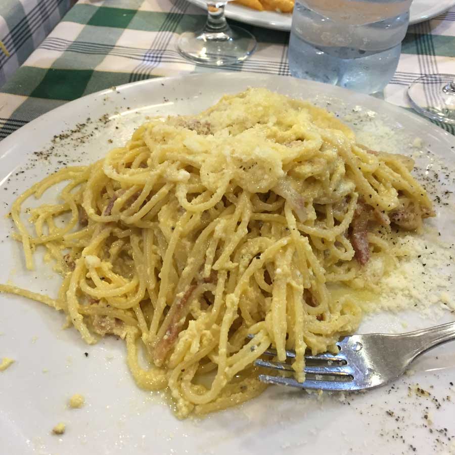
Typically I am not a big pasta eater. BUT when I go to Italy, I eat it every day. It is so different than anything you will have in the US. I believe it is the freshness that is the difference. Sure, good ingredients, but oh so fresh.
My Takeaway:
What makes a good website? Good design, yes, good programming, sure. But that all goes away after your site is launched. What makes a good website for the long haul is freshness. If people come to your website and it is the same old thing, they ain’t staying. You should constantly be changing/adding content. New imagery is equally important. If you are an e-commerce site, adding new offerings, having sales, specials, are all things which keep a site fresh and keep your customers coming back.

Bottom Line:
There is beauty and examples of greatness all around us. Keep your eyes open and take inspiration from the wonders you see (and eat). Incorporate these things into whatever you do. For me of course it is building and managing websites.