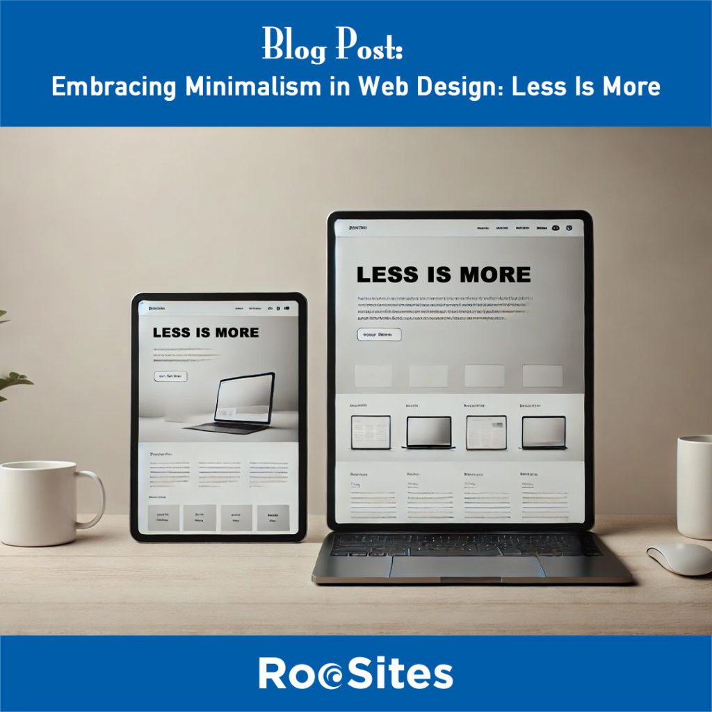
One of the main goals of minimalism in web design is to make navigation and user interactions as seamless as possible. When websites are stripped of unnecessary elements, users can focus on what truly matters – the content. With clean layouts, ample white space, and straightforward navigation, users can quickly find what they need, making it more likely for them to stay longer on your site. Minimalist design eliminates distractions, allowing users to engage more effectively with the brand’s message or products.
Complex designs with heavy graphics, animations, and multiple elements can slow down website loading times, which directly affects user retention and SEO rankings. Minimalist designs, on the other hand, typically use fewer resources and lighter elements. This results in faster loading speeds, which is essential for keeping users engaged and boosting SEO. In a world where users expect a site to load within seconds, minimalism can give your website the speed advantage it needs to keep up.
Minimalist design is known for its clean lines, simplicity, and focus on essential elements, creating a timeless look that doesn’t go out of style. While trends come and go, a well-crafted minimalist website remains visually appealing and relevant over the years. This long-lasting appeal not only saves redesign costs but also builds a consistent brand identity that resonates with users.
Websites cluttered with images, buttons, and text can overwhelm visitors and deter them from taking action. Minimalism simplifies the user journey by guiding attention to the most important elements, such as call-to-action buttons and forms. By reducing distractions, minimalist web design helps users focus on completing specific actions, such as signing up, purchasing, or contacting. This clarity can significantly increase conversion rates and improve ROI.
Content is the heart of any website. In a minimalist design, content takes center stage, with design elements working to support rather than overshadow it. With fewer design distractions, users can fully engage with the information presented, whether it’s a blog post, product description, or service overview. By letting content shine, minimalist web design ensures that the message is delivered clearly and effectively.
A minimalist website is often easier to maintain because it has fewer elements to update and manage. This makes it simpler to scale as your business grows or when content needs change. Whether you’re adding a new section or tweaking existing content, minimalism offers flexibility, as well-organized and clean layouts allow for straightforward updates without overhauling the entire design.
To implement a minimalist approach, designers focus on a few core principles:
Minimalism in web design is not about doing less; it’s about doing more with less. By focusing on essential elements, minimizing distractions, and enhancing functionality, minimalist websites create a pleasant user experience that keeps visitors engaged and coming back. Adopting minimalism in your web design strategy can be the key to standing out in a crowded online landscape while ensuring that your message is clear, your brand memorable, and your site highly functional.
In the end, minimalism is about clarity, elegance, and efficiency. And in web design, these qualities can make all the difference. Contact RooSites today for assistance!
Related Content: